
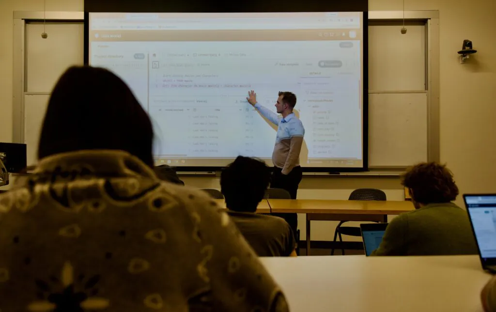
A classroom of students hunches over their laptops, dragging color palettes across dashboards and debating the merits of a scatter plot versus a slope chart. At the front of the room, Assistant Teaching Professor Eric Bogert watches with quiet satisfaction. The real lesson, he knows, is not on the screen, but in the struggle to make a dataset speak.
Bogert, a Rupert Award-winning faculty member at the D'Amore-McKim School of Business, teaches MISM 3501: Information Visualization for Business, a course at the intersection of art, psychology, and data science. While the syllabus promises students the ability to select appropriate methods to represent business data, the class delivers something more ambitious: a foundation in visual thinking for a data-driven world.
What distinguishes Bogert's classroom is his use of competition as a teaching tool. Each year, he encourages students to submit their work to Iron Viz, one of the most prestigious data visualization competitions globally. His students regularly rise to the challenge.
“In a regular assignment, the payoff to truly excel is capped,” Bogert said. “In a competition, the reward for being the best is exponentially greater.”
That distinction matters. Traditional grading systems often compress performance at the top, making it difficult to distinguish exceptional work. Competitions, by contrast, create a clear signal of excellence. For Bogert, they unlock a level of creativity and effort that a rubric alone cannot inspire.
Teaching design to non-designers

Most business students do not enter the course thinking of themselves as designers. Bogert embraces that reality. Trained as a data scientist, he is candid about his own learning curve in the artistic side of visualization, a transparency that encourages students to experiment.
His approach focuses first on clarity and accuracy. Aesthetic refinement comes later. By grounding students in core principles, he helps them develop strong visual judgment, regardless of their creative background.
To reinforce those standards, Bogert regularly shares professional-level submissions and judges' feedback from major competitions. The goal is to show that effective visualization is not subjective, but guided by widely accepted best practices.
At the same time, he encourages independent thinking. Even widely accepted conventions are open to debate. In discussing typography, for example, Bogert notes that while some experts advocate serif fonts, he finds evidence supporting sans-serif in most business contexts. The point is not the font choice, but the mindset: decisions should be grounded in evidence, not habit.
Learning through competition
For students, competitions like Iron Viz turn classroom concepts into real-world opportunities.
For Jane Kamata, DMSB‘26, the experience began as an extension of the course. After taking MISM 3501, she returned as a teaching assistant and chose to complete the competition assignment alongside students.
“After taking the course, I realized that data visualization is something I might want to pursue,” Kamata says. “I wanted to challenge myself while taking advantage of the opportunity.”
Her submission required more than 40 hours of iterative work, combining analysis, storytelling, and design. The payoff extended far beyond the classroom. Winning the competition strengthened both her technical confidence and her professional presence. “Through my win, I spoke on stage at the Tableau Conference in front of thousands of people. Since then, public speaking is a lot less nerve-wracking.”
The recognition also opened doors across the data community, from networking opportunities to industry involvement, reinforcing her decision to pursue a career in the field.
For Hanne de Bie, DMSB‘26, the path to Iron Viz was shaped by Bogert's encouragement.
“He made one of our final assignments identical to the competition and really advocated for students to submit,” she says. “His feedback made a big difference.”
De Bie spent roughly 30 hours developing her visualization, drawn to the balance of creativity and technical skill. “I had so much fun making my submission. It allowed me to get creative while building my technical skills.”
Winning came as a surprise, but it reshaped her perspective. “This award gave me a lot more confidence in my future potential,” De Bie says. “I realized how much I enjoy this work.”
Human ingenuity in the age of AI
As artificial intelligence reshapes classrooms and workplaces, Bogert is often asked what happens when machines can generate “good enough” work. His answer is clear: in data visualization, human judgment still leads.
While AI tools can quickly produce functional charts, Bogert argues they cannot replicate the nuanced decision-making required to tell a compelling story with data. Understanding context, selecting the right visual form, and guiding an audience's interpretation remain important human skills.
In that sense, the course carries urgency. As AI raises the baseline of technical ability, the competitive edge shifts to those who can think critically about how data is presented, not just processed.
A lasting impact
Each spring, when Iron Viz results are announced, Bogert calls it his favorite day of the year. “I'm so lucky to have taught such brilliant students,” he says.
In a business landscape increasingly defined by data, the ability to transform numbers into clear, compelling narratives is no longer a niche skill. It is a competitive advantage. In Bogert's classroom, that advantage begins not with the final product, but with the process of learning how to see it.